Starting out with A/B testing can feel a bit overwhelming. Where do you even begin? Honestly, the best first tests usually target the main conversion spots—think call-to-action buttons, headlines, and checkout steps. These areas really move the needle on revenue and how users act.
Forget about tiny design tweaks at first. Focus on elements that shift your core business metrics. If you pick the right things, you’ll see measurable improvements that actually matter.

If you want your first tests to work, you’ve gotta figure out which changes will give you clear data and a solid foundation for later. Most smart companies go after high-traffic spots first. Even a tiny win on a popular page can make a big difference.
This approach helps you set up good baselines and builds trust in the process. It’s not just about guessing—it’s about making every test count.
You’ll need to balance potential impact with things like how much traffic a page gets, how tricky it is to change, and what resources you have. Here’s some advice on finding the best starting points for meaningful results and sustainable growth.
Understanding A/B Testing Fundamentals
When you run A/B tests, you split your audience into two groups and show them different versions of your digital content. This takes out the guesswork and gives you real numbers about what actually works.
Definition of A/B Testing
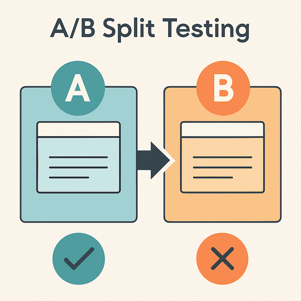
A/B testing (or split testing) compares two versions of a webpage or app to see which one does better. You show Version A (the original) to one group and Version B (the new one) to another.
You only change one thing at a time, so you know exactly what’s making the difference in user behaviour.
This method keeps personal bias out of decisions. You make choices based on how users actually interact, not just what you think will work.
You can use A/B tests on websites, apps, emails, and ads. Every test starts with a simple guess: “If we change X, will Y happen?”
Purpose and Benefits
A/B testing lets businesses make decisions with data, not just hunches. You find out which tweaks actually boost user engagement and conversions.
The biggest perk? Less risk. Instead of rolling out changes to everyone and hoping for the best, you test with smaller groups first.
Sometimes, users surprise you. What seems like a great idea in the office might not land with real people.
A few big benefits:
- Higher conversion rates
- Smoother user experience
- Fewer people bouncing off your site
- More revenue per visitor
- Cheaper customer acquisition
A/B testing also encourages teams to experiment and challenge assumptions. You end up trusting data more than opinions.
Key Metrics in A/B Testing
Conversion rate is the main thing most people track. It’s just the percentage of users who do what you want, like buy something or sign up.
Click-through rate (CTR) tells you how many folks click on things like buttons or links. This helps you fine-tune your calls to action and site navigation.
Bounce rate shows the percentage of users who leave after seeing just one page. If you lower this, you’re probably engaging visitors better.
Metrics like drop-off points dig deeper and show why one version wins over another. They give you the story behind the numbers.
You’ll want statistical significance to know if your results are real or just a fluke. That means you need enough visitors and time for each test.
If you run an e-commerce site, keep an eye on revenue per visitor and average order value. These tell you how much cash your changes bring in.
Criteria for Prioritising A/B Test Candidates

To get the most out of A/B testing, you’ve gotta pick your test candidates wisely. Go after pages with lots of traffic, spots where users get stuck, and use real data—not just gut feelings.
High-Impact Pages and Elements
Pages that get the most visits should go to the top of your testing list. Home pages, product pages, and checkout flows usually bring the most action.
If you’re running ads, test those landing pages ASAP. They have a direct effect on your ad spend and your conversion rates.
Some high-impact elements:
- Main call-to-action buttons
- Headlines and value props
- Navigation menus
- Product images and descriptions
- Price displays
Form fields on checkout or sign-up pages are huge opportunities. Try shortening forms or tweaking field labels—this can seriously boost completion rates.
Don’t forget about email sign-up forms or newsletter boxes. Even changing a button color or bit of text can grow your list fast.
User Experience Bottlenecks
Analytics can show you where people drop off or get frustrated. Pages with high bounce rates or low conversion rates are perfect for testing.
Heat maps let you see where users click, scroll, or just get lost. If folks aren’t clicking where you want, it’s time to experiment.
Common bottlenecks worth testing:
- Slow-loading pages or images
- Confusing site navigation
- Mobile issues
- Unclear product info
- Complicated checkouts
Exit intent data reveals the moment users bail. Fixing these pain points with A/B tests can make a big difference.
Check customer support tickets and feedback, too. If users complain about something specific, test a fix for it. You’ll likely see quick wins.
Data-Driven Decision Making
Smart A/B test prioritisation frameworks use objective scoring, not just hunches. The PIE framework looks at Potential impact, Importance to your business, and Ease of making the change.
Traffic numbers tell you if you’ll get enough data to trust your results. Pages with too few visitors just won’t give you clear answers.
Key metrics to help you prioritise:
- Monthly unique visitors
- Current conversion rates
- Revenue per visitor
- Customer lifetime value
- Time to reach significance
Set baseline numbers before you start. That way, you know if your changes actually work.
Look back at what you’ve tested before. If something showed promise, keep optimising it.
Top Elements to A/B Test First
If you’re new to this, start with high-impact stuff that changes how users behave or convert. Test one thing at a time so you know what’s working.
Call-to-Action Buttons
Call-to-action buttons are where the magic happens. If you want more conversions, test these first.
Button text matters a ton. Try “Buy Now” vs. “Get Started” or “Learn More.” Sometimes just changing the words boosts clicks by 20-30%. Action words beat passive ones almost every time.
Button color can change how people feel. Red creates urgency, blue builds trust, and green is great for “go” actions like buying or signing up.
Size and placement also play a big role. Bigger buttons usually get more clicks, but if you go too big, it can look spammy. Try moving buttons above the fold and see what happens.
| Element | High-Impact Variations | Expected Results |
|---|---|---|
| Text | “Buy Now” vs “Get Started” | 15-25% difference |
| Colour | Red vs Blue vs Green | 10-20% difference |
| Size | Small vs Medium vs Large | 5-15% difference |
Headline Variations
Headlines are your first shot at grabbing attention. Visitors decide in seconds if they’ll stick around.
Clear value props work better than clever puns. “Save 30% on Energy Bills” beats “Revolutionary Energy Solution” every time.
Short vs. long headlines—test both. Some folks like quick, punchy lines; others want more detail. Try a 5-word headline against a 15-word one and see what sticks.
Emotional triggers can really move the needle. Words like “Limited Time,” “Join 10,000 Users,” or “Don’t Miss Out” all work differently. Testing high-impact elements shows which emotion your crowd responds to.
Try headlines as questions versus statements. “Ready to Double Your Sales?” and “Double Your Sales Today” appeal to different people.
Above-the-Fold Content
Above-the-fold content shapes first impressions before anyone scrolls. It’s prime real estate.
Hero images set the tone. Test product shots against lifestyle pics. Usually, pro photography beats stock photos by a mile.
Layout matters more than you’d think. Single-column works best on mobile, but desktop users might like multi-column. Test layouts to see what’s easiest to read.
Social proof (like testimonials or client logos) builds trust fast if you put it up top. Try different types and placements to figure out what’s most convincing.
Form length is huge. Short forms get more sign-ups, but sometimes longer ones bring better leads. Test a 3-field vs. a 7-field form to see what fits your goals.
Testing these areas gives you quick feedback on what your users want.
Optimising Conversion Paths Early On

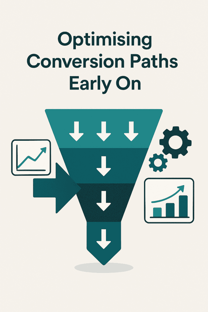
If you want to make more money fast, start testing your conversion paths first. Landing pages and navigation guide visitors and influence their decisions.
Landing Pages
Landing pages are your first impression, so don’t ignore them. Visitors decide super quickly if they’ll stick around.
Headlines are the best place to start. A great headline can boost conversions by 30-50%. Try out different benefits and value props.
Call-to-action buttons need testing for both the words and where you put them. “Get Started” usually beats “Submit” or “Click Here.” Color and size matter, too.
Form length changes results a lot. Short forms convert more, but sometimes longer forms bring better leads. Start by ditching unnecessary fields.
Social proof like testimonials or trust badges builds credibility. See if putting them above the fold or near forms works better. For B2B, client logos and reviews are gold.
Always test one thing at a time so you know what’s working. A/B testing strategies for enhanced conversion rates help you find the biggest wins.
Navigation Menus
Navigation makes or breaks the user experience. If people can’t find what they need, they bounce.
Menu structure affects how people move around. Try horizontal vs. vertical, or dropdowns vs. mega menus. Usually, simpler is better.
Labels should be clear and familiar. Test jargon against plain English. Sometimes “Services” beats “Solutions,” depending on your crowd.
Search bar placement changes how often people use it. Try it in the header or sidebar. Adding suggestions or filters can help, too.
Mobile navigation is a world of its own. Hamburger menus vs. visible options—see which gets more taps.
Keep an eye on things like pages per session and bounce rates, not just conversions. These show if your navigation tweaks are making the site easier to use.
Testing Content and Messaging

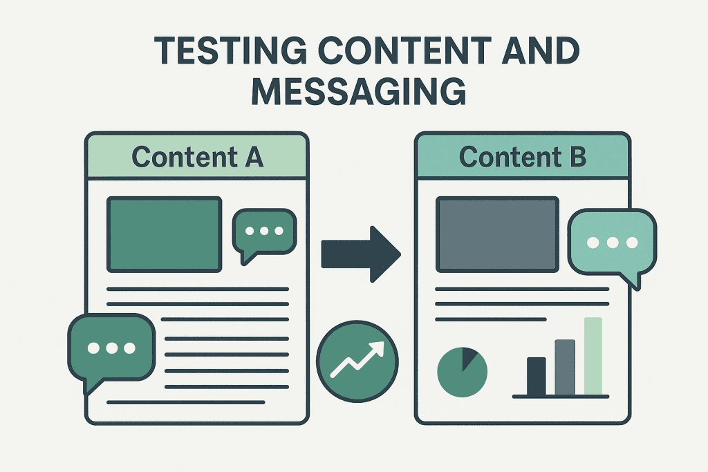
When you test content and messaging, you find out which words, offers, and visuals actually get people to respond. These details shape how visitors see your brand and decide what to do next.
Value Propositions
Value propositions are basically your first shot at convincing someone to stick around. If you test a few different ones, you can figure out which benefits actually click with your audience.
Try out headline variations that highlight different perks. Maybe one headline talks about cost savings, while another focuses on saving time or boosting quality.
The tone of your messaging totally matters, too. A professional vibe might work for B2B, but a friendly, casual style could win over regular consumers.
Switching up the order of benefits can show you what people care about most. Lead with the strongest one, but let your test results guide you—not just your gut.
Play with how specific you get. “Save money” feels different than “Save £200 per month” or “Cut costs by 40%.” Specifics can make a big difference.
Trying different messaging and attributes can seriously change how your campaigns perform across channels.
Form Fields
Optimising forms is a must because every extra field could make someone bail. If you test strategically, you’ll find out what info you really need without scaring people off.
Start by testing how many fields you ask for. Try a short form versus a long one—begin with just the essentials, then add more if your data says you need it.
Field labels can make a surprising impact. “Email” might get a different response than “Email Address” or “Work Email,” depending on your crowd.
Decide which fields are truly required and which can be optional. Only make the must-haves mandatory to keep abandonment rates down.
How you arrange form fields also matters. Group similar info together and put things in an order that feels natural for users.
If you want to get fancy, try progressive profiling—collect more info over time, not all at once.
Imagery and Visuals
Visuals hit people right away and send a message before they even read a word. Testing images can seriously boost engagement and conversions.
Focus on hero images first since they’re front and center. See how product photos stack up against lifestyle shots, or test pro pics versus real, user-generated ones.
Photos with people can build trust fast. Try different demographics, professional versus candid shots, and see what your audience actually connects with.
Colour schemes do more than just look pretty—they affect how people feel and act. Test button colours, backgrounds, and accents, but keep your brand’s vibe consistent.
Where you put images—image placement—shapes how users move through your page. Try images above or below your main message, or left versus right, and see what works.
Don’t forget about video thumbnails, infographics, and icons. They’re all fair game for testing and can help people understand your message faster.
Technical Considerations When Running Initial Tests

Before you kick off your first A/B test, make sure you’ve got enough traffic and have sorted out your audience segments. Otherwise, you might end up with useless data.
Traffic Volume Requirements
Most A/B tests need at least 1,000 visitors per variation to spot real changes. This helps you avoid random noise messing up your results.
Figure out your sample size before you start. If your conversion rate is 2%, you’ll want about 4,000 visitors per variation to notice a 20% bump with 95% confidence.
Minimum traffic guidelines:
- Simple button tweaks: 1,000-2,000 visitors per variation
- Landing page updates: 3,000-5,000 visitors per variation
- Complex flows: 5,000+ visitors per variation
Don’t rush things. If you run A/B tests too fast without enough data, you’re just guessing. Let the numbers build up.
If your site’s on the smaller side, focus on big changes first. Test headlines or call-to-action buttons before you mess with tiny details.
Segmentation and Target Audiences
Aim your first tests at specific user segments, not everyone at once. New visitors act differently from returning ones, so split them up when you look at results.
Try segmenting by:
- Traffic source: Organic search or paid ads
- Device: Mobile or desktop
- Location: Different regions, different habits
- User status: Are they new or coming back?
Mobile users usually convert less and bounce more. Test mobile tweaks separately from desktop ones so you don’t mix up your findings.
Dialed-in targeting helps you see what works for whom. A headline that works for new folks might just puzzle returning customers.
Start broad, then get more specific as you learn. Once you spot patterns, you can drill down into smaller groups.
Setting Up Baselines and Measuring Success
You can’t run good A/B tests without setting baseline metrics first. Baselines help you know what’s normal, so you can spot real improvements.
Establishing Benchmarks
Track your usual website data for at least two weeks before testing anything. This way, you catch daily ups and downs and get a true average.
Metrics worth tracking:
- Conversion rates by traffic source
- Average session length
- Bounce rates for each page type
- Revenue per visitor
Skip big holidays or sales events during your baseline period. Those just mess with your numbers.
Project baselines give you a target to measure against as you go. Stick with the same measurement methods so you can trust your comparisons.
Most testing tools want at least 1,000 visitors per variation. Smaller sites might need more time to hit that mark.
Analysing Test Results
Wait until you hit at least 95% confidence before you call a winner. Ending tests early just because you’re eager can backfire.
When you look at results, check:
- Primary metrics: The main thing you wanted to improve
- Secondary metrics: Extra context to back up your findings
- Segments: How different groups responded
- External stuff: Like traffic spikes or seasonality
Let your tests run their course. Cutting them short just because early numbers look good can lead you in the wrong direction.
Set clear goals and metrics before you start. Always compare results to your baseline, not just between test versions.
Keep notes on everything you learn. It’ll make your next round of tests way easier.
Common Mistakes to Avoid in Early A/B Testing
A lot of new testers jump in without a plan, and that’s a recipe for wasted time.
Testing too many things at once just muddies the waters. Change one thing at a time so you know what’s actually working.
Plenty of teams test the wrong stuff instead of focusing on things that really move the needle. Start with the big stuff that affects conversions.
Stopping tests too soon is a classic mistake. Give your experiment enough time to gather data from all your user groups.
| Common Early Mistakes | Better Approach |
|---|---|
| No clear hypothesis | Decide what you expect before testing |
| Wrong sample size | Figure out how many visitors you need |
| Testing during holidays | Stick to normal traffic periods |
Running tests without a hypothesis is just guessing. Always have a reason and a prediction for every test.
Ignoring mobile users skews your results. Test on different devices since what works on desktop might flop on mobile.
Don’t get hung up on vanity metrics like clicks. Focus on stuff that actually matters for your business, like revenue.
Leaving out team members can cause headaches later. Loop in design, marketing, and dev folks from the start.
Testing during weird times—like holidays—gives you junk data. Pick steady periods when user behaviour is normal.
Most mistakes in A/B testing happen after launch, especially when there’s pressure to make quick calls. Take your time and trust the process.
Next Steps After Your First A/B Tests
So, you’ve wrapped up your first A/B test—now what? Take a good look at the results and see which version actually did better. Try to figure out why, if you can.
Jot down what you found in a simple table like this:
| Test Element | Version A | Version B | Winner | Confidence Level |
|---|---|---|---|---|
| Button colour | Red | Blue | Blue | 95% |
| Headline | Original | New | Original | 87% |
Don’t rush to make changes if you don’t have enough data. It’s tempting, but waiting for a solid sample size gives you more reliable answers.
A/B testing isn’t a one-and-done thing. You’ll need a bit of patience and a plan. Every test gives you something new to work with.
Think about what you’ll test next based on these results. If users liked the blue button, maybe try out different shades of blue next.
You could also test things that connect to your last win. If a new headline got more clicks, try out a few tweaks to that same style.
Set up a testing schedule to keep things organized. Running too many tests at once just makes everything confusing. It’s hard to tell what actually made a difference that way.
Share what you learn with your team. When everyone sees the data, it’s easier to make decisions based on what users really do—not just guesses.
Keep track of all your tests, even the ones that flopped. Over time, you’ll start to notice patterns.


