Clean minimal branding has become a powerful approach for companies looking to make a lasting impression. This style focuses on simplicity and clarity, stripping away unnecessary elements to create a strong visual impact. Minimalist branding can boost your brand by using clean, uncluttered design that’s easy to grasp.

We often see this style in logos, packaging, and websites that use limited colour palettes and basic typography. The goal is to convey a brand’s essence without overwhelming the audience. This approach can help a company stand out in a crowded market and create a memorable identity.
Clean minimal branding isn’t just about looks. It’s about aligning your brand identity with your core values and messaging. By focusing on what’s truly important, companies can create a consistent and authentic brand experience across all touchpoints.
Key Takeaways
- Clean minimal branding uses simplicity to create a strong visual impact
- This approach helps companies stand out and convey their core values
- Consistency across all brand elements is crucial for effective minimal branding
The Essentials of Clean Minimal Branding

Clean minimal branding strips away excess to highlight a brand’s core essence. It focuses on simplicity and clarity to create a lasting impression.
Understanding Minimalism in Branding
Minimalism in branding is about distilling a brand’s identity to its most essential elements. We aim to create a clean design that communicates clearly and effectively. This approach emphasises functionality and a minimalist style.
Key elements include:
- Simple logos
- Limited colour palette
- Ample white space
- Clear typography
White space improves minimalist branding by creating an uncluttered look. It allows the core message to stand out. Negative space is not empty; it’s a powerful tool for guiding attention.
Brand identity in minimalism focuses on what’s truly important. We strip away unnecessary details to reveal the brand’s essence.
Importance of a Professional Designer
A professional designer is crucial for creating an effective minimalist brand. They bring expertise in balancing simplicity with impact. Their skills ensure that the stripped-down design still conveys the brand’s personality.
Designers understand how to:
- Choose the right elements to keep
- Create custom brand assets
- Ensure consistency across platforms
The branding process with a professional involves deep analysis of the brand’s values and goals. This insight helps in crafting a minimal design that resonates with the target audience.
A skilled designer can refine your messaging to its core. They help identify the unique value proposition that sets your brand apart.
Crafting a Minimalist Logo
Minimalist logos strip design down to its core essentials. They focus on simplicity and clarity to create a lasting impression. Let’s explore the key aspects of crafting an effective minimalist logo.
Key Characteristics of Minimalist Logos
Minimalist logos are all about simplicity and impact. They use clean lines, basic shapes, and lots of white space. These logos are easy to remember and look good at any size.
The best minimalist logos are:
- Simple yet distinctive
- Scalable across different mediums
- Highly legible even at small sizes
A great example is the FedEx logo, which cleverly uses negative space to create an arrow between the ‘E’ and ‘x’.
When designing, we should focus on one or two key elements that represent the brand’s essence. This could be a single geometric shape or a stylised letter from the company name.
Inspiration and Concept Development
To create a standout minimalist logo, we need to start with solid inspiration and concept development. Here are some tips:
- Research your industry and competitors
- Sketch out lots of ideas, no matter how rough
- Experiment with basic shapes and lines
- Try different combinations of elements
We can find logo inspiration from various sources like nature, architecture, or even abstract concepts related to the brand.
It’s crucial to understand the brand’s values and personality. This knowledge helps us choose the right visual elements that truly represent the company.
Typography in Logo Creation
Typography plays a vital role in minimalist logo design. The right font can make or break a logo’s effectiveness. Here’s what to consider:
- Choose sans-serif fonts for a modern, clean look
- Opt for geometric fonts to complement simple shapes
- Experiment with letter spacing and weight
Custom typography can set a logo apart. We might modify existing fonts or create entirely new letterforms to achieve a unique look.
Remember, the text in a minimalist logo should be easily readable at various sizes. It’s often best to stick to one or two words maximum.
Design Elements and Principles

Clean minimal branding relies on a few key design elements and principles. These include the strategic use of white space and careful composition, as well as thoughtful application of texture and colour.
Leveraging White Space and Composition
White space is crucial in minimalist design. We use it to create balance and focus attention on key brand elements. Negative space helps reduce visual clutter and enhances readability.
In composition, we follow the ‘less is more’ approach. We carefully place each element to create a harmonious layout. This might involve:
• Aligning text and images to a grid • Using asymmetry for visual interest • Creating focal points through strategic placement
Sans-serif fonts are often preferred for their clean, modern look. We choose typography that’s easy to read and reflects the brand’s personality.
Selective Use of Texture and Colour
While minimalism favours simplicity, texture and colour can add depth to clean designs. We use these elements sparingly to create visual interest without overwhelming the design.
Texture can be subtle, like a slightly embossed logo or a matte finish on packaging. It adds a tactile element that engages the senses.
For colour, we often stick to a limited palette. This might include:
• Monochromatic schemes • Black and white with a single accent colour • Muted tones that complement each other
Branding colours are chosen carefully to reflect the brand’s values and appeal to the target audience. We ensure they work well across different mediums, from digital to print.
The Role of Typography in Branding
Typography plays a crucial part in creating clean, minimal branding. It shapes how people see and feel about a brand. Good typography makes brands easy to spot and remember.
Choosing the Right Typeface
When picking fonts for minimal branding, we often go for clean and modern options. Sans-serif typefaces like FF DIN and Avenir Next work well. These fonts look fresh and simple.

Sans-serif fonts have no small lines at the ends of letters. This makes them easy to read on screens. They also fit nicely with clean designs.
Some brands use just one typeface for everything. Others mix two or three fonts. The key is to keep things simple and neat.
Creating Harmony and Legibility
Good typography helps people read and understand brand messages. We need to think about how letters look together on a page or screen.
Clean, minimal fonts make text easy to read. We pay attention to letter spacing and line height. This stops words from looking squashed or spread out.
For clean branding, we often use black text on white backgrounds. This gives the best contrast. But some brands use soft greys for a gentler look.
We also think about text size. Headlines should be big and bold. Body text needs to be a comfortable size to read.
Maintaining Consistency Across Branding
Clean, consistent branding helps build recognition and trust. We’ll explore how to maintain a cohesive brand identity using repeatable elements across different channels and materials.
Brand Identity and Repeatable Elements
Consistent branding reinforces a company’s identity and values. We focus on key visual elements that create a unified look:
- Colours: Use a defined palette across all materials
- Typography: Stick to 2-3 fonts for headings and body text
- Logo: Place it consistently and use approved variations
- Imagery style: Choose photos or illustrations with a similar feel
Clean design often uses geometric forms and white space. This creates a modern, professional look that’s easy to replicate.
A brand style guide is essential. It outlines rules for using brand elements correctly. This helps maintain consistency as the brand grows.
We recommend reviewing branding trends yearly. This keeps the look fresh whilst staying true to the core identity.
Navigating Current and Future Branding Trends

Clean, minimal branding continues to evolve. We’re seeing shifts in aesthetics and design that are shaping modern brand identities. Let’s explore the key trends and look ahead to what’s next.
Adapting to Evolving Aesthetics
Monochromatic colour schemes are gaining popularity in minimal branding. These palettes use varying shades of a single colour to create a refined look. We’re also noticing a move towards serif fonts in logo design, breaking from the sans-serif trend of recent years.
Minimalist designs are embracing subtle textures and patterns. This adds depth without cluttering the visual space. Many brands are opting for simple geometric shapes in their logos and graphics.
To stay current, we recommend:
• Using limited colour palettes • Experimenting with typography • Incorporating subtle design elements
Predicting the Next Wave in Design
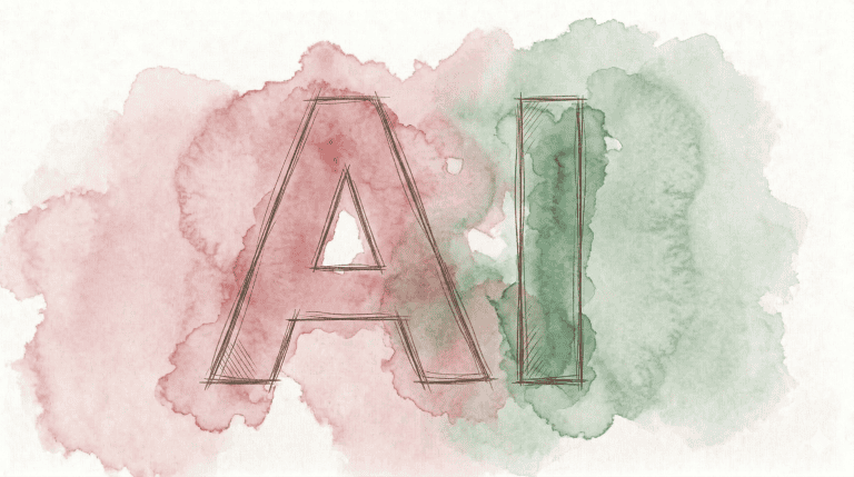
Looking ahead, we expect AI integration to play a bigger role in branding. This may lead to more personalised and adaptive brand experiences.
Sustainability is likely to influence design choices. We anticipate seeing more eco-friendly materials and green-inspired colour schemes.
Digital-physical fusion may shape future branding trends. This could mean:
• AR-enhanced logos • Interactive packaging designs • Virtual brand experiences
As consultants, we’re watching these developments closely. The key will be balancing innovation with the timeless appeal of clean, minimal design.
Frequently Asked Questions
Clean minimal branding relies on simplicity and focus to create powerful visual identities. It strips away excess to highlight core brand elements and messages.
What constitutes effective minimalist graphic design in brand identities?
Effective minimalist graphic design uses clean lines, basic shapes, and limited colours to create visual impact. It focuses on essential elements and removes unnecessary details.
Key components often include a simple logo, ample white space, and a restrained colour palette. Typography choices are typically sleek and uncluttered.
How can clean and minimal branding enhance consumer perception of a company?
Clean branding can make a company appear more professional and trustworthy. It communicates efficiency and clarity of purpose.
Minimal designs are often easier to remember, improving brand recall. They can also convey a sense of modernity and sophistication.
Which strategies are essential for creating a successful minimalist brand?
Successful minimalist brands start with a clear brand essence. They distil this into simple, memorable visuals and messages.
Consistency across all touchpoints is crucial. This includes packaging, websites, and marketing materials.
In what ways can minimalist branding be integrated into digital marketing?
Digital marketing can embrace minimalism through clean website designs and uncluttered social media posts. Simple, eye-catching visuals work well in crowded online spaces.
Email marketing can use minimal templates to highlight key messages. Mobile apps benefit from intuitive, streamlined interfaces.
What are the core principles behind minimalism in corporate branding?
Core principles include simplicity, clarity, and focus. Minimalist corporate branding aims to communicate brand values efficiently.
It often involves removing unnecessary elements to create a timeless, versatile identity. Quality over quantity is a key concept.
How does minimalist branding influence customer engagement and loyalty?
Minimalist branding can create a sense of calm and order. This can lead to positive associations and increased brand affinity.
Clear, consistent branding makes it easier for customers to recognise and connect with a brand. This familiarity can foster loyalty over time.
